Saha Yoga
Role
Visual designer
Date
2025
Project Type
Visual re-branding

I worked as a freelance visual designer for Saha Yoga, a Stockholm-based yoga and wellness brand, built around inclusivity, creativity, nature and community. As the brand evolved from intimate yoga gatherings into a growing wellness collective, it needed a visual identity that reflected its vibrant personality and holistic values.
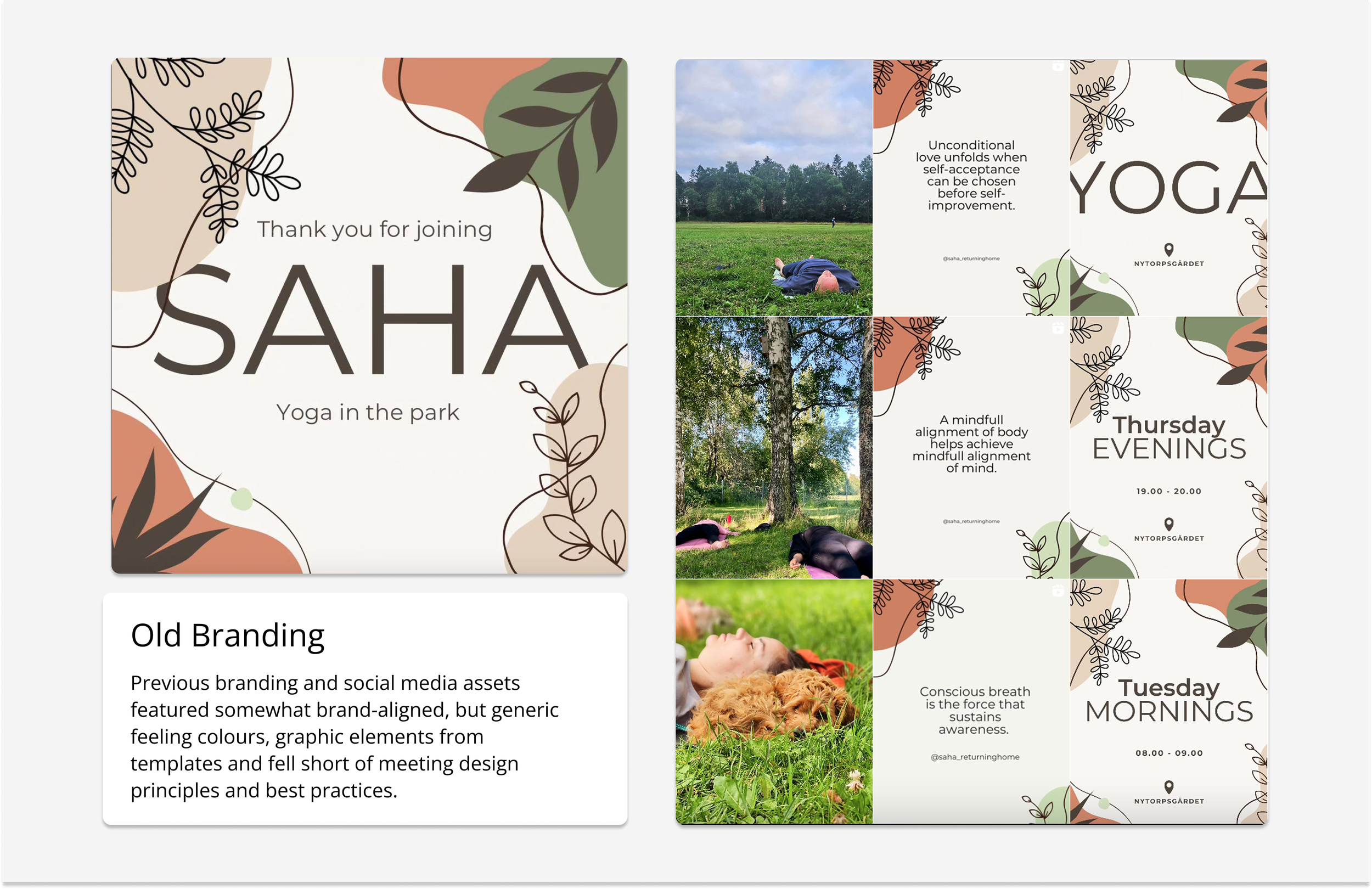
Many yoga brands in Stockholm share a similar visual language: soft neutral colours, serif fonts and minimalist styling. Whilst calming, this aesthetic often blends into the background and fails to communicate personality or creativity. Saha’s co-founders envisioned something different, a brand identity that radiates warmth, colour and energy, yet remaining soft and inclusive.
The rebrand aimed to position Saha Yoga as a creative, welcoming and modern voice in a saturated local yoga scene, one that often relies on generic, muted aesthetics and templated logos.
Challenge
To design a brand system that balances excitement with calmness, boldness with warmth and creativity with a sense of belonging.
Goals
To differentiate Saha Yoga from the sea of neutral-toned competitors.
To reflect the brand’s core values, inclusivity, mindfulness, creativity and connection to nature.
To invoke balance between minimalism and maximalism, a refined yet expressive visual language.
Deliverables
Brand kit including:
Logo,
Typography,
Colour palette,
Graphic elements,
Social media and print applications.
Research & Insights
The process began with a competitive visual analysis of Stockholm’s yoga and wellness landscape. Studios like Yoga Rummet conveyed calmness but lacked distinct visual personality. Online leaders like Yoga with Adriene showcased accessibility and authenticity but leaned heavily on personal branding.
Insights revealed a gap for a visually rich, design-conscious yoga brand - one that celebrates creativity, community and individuality.
Inspiration also came from a photograph of Saha’s co-founders dressed in vibrant pink and orange hues, surrounded by lush greenery. This image became the emotional and visual anchor for the new identity - a symbol of connection, energy and harmony with nature.
Concept Development
The concept for Saha Yoga’s new identity evolved around the idea of energy in balance.
Visually, this meant blending expressive forms and vibrant colours with calm compositions and soft, fluid, illustrative graphic elements.
The design language sits between minimalism and maximalism, refined enough to feel contemporary and serene, yet playful and organic enough to express creativity and inclusivity.
Design Solution
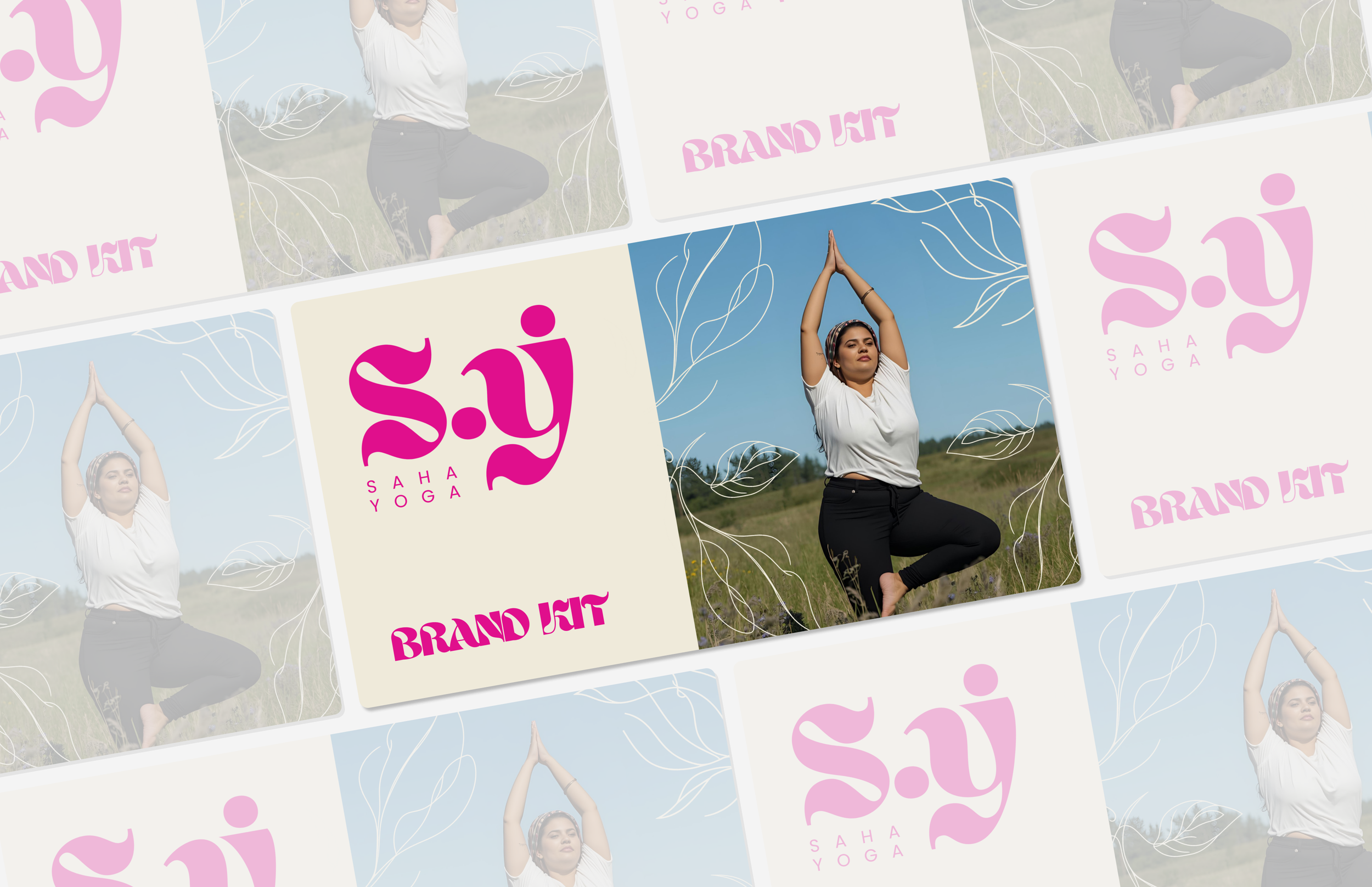
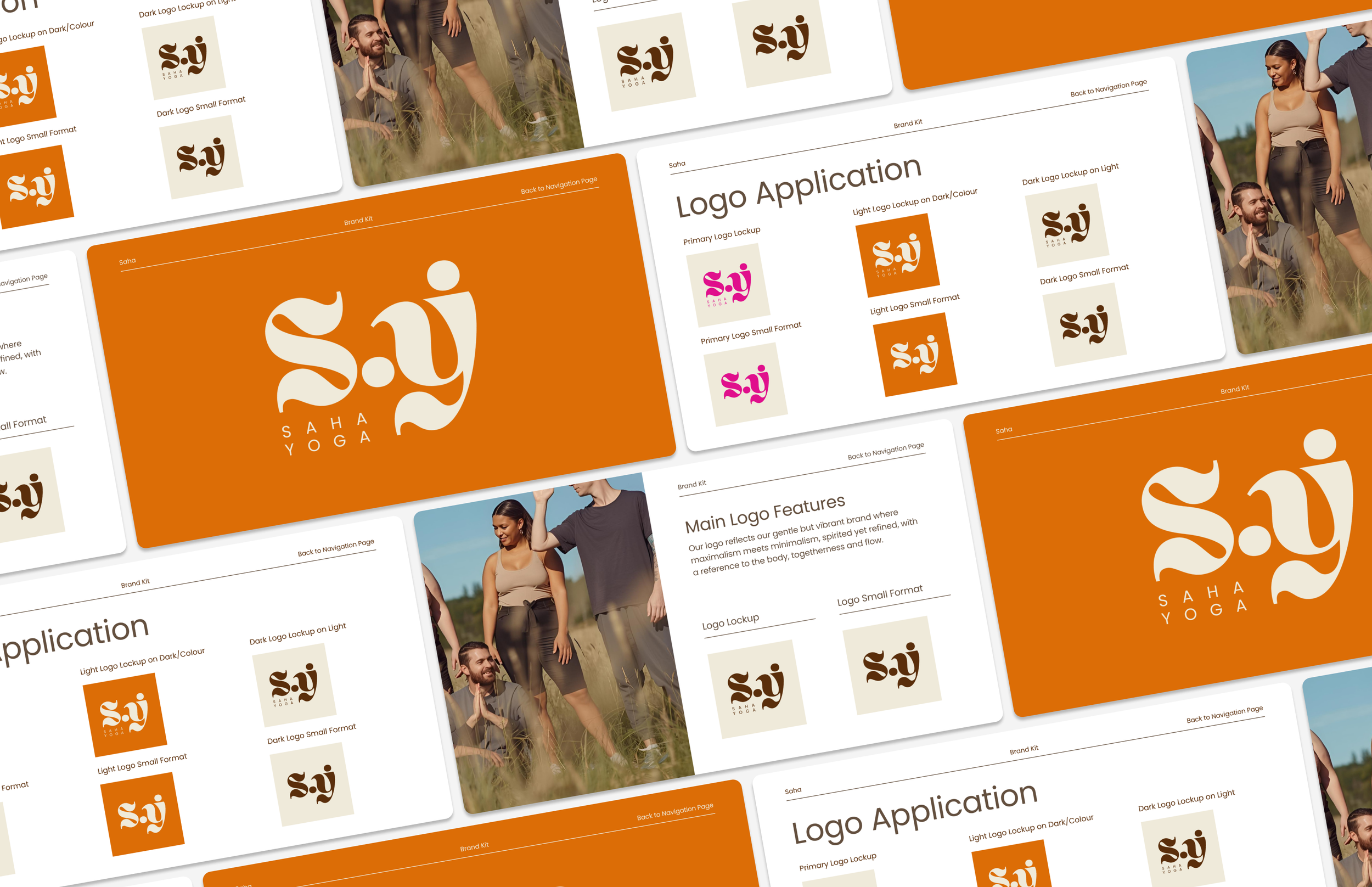
Logo & Symbolism
The logo embodies flow and togetherness, the organic shapes of S(aha) and Y(oga) from the Ahsing font, suggest both the body in movement and a sense of unity. The clean geometry balances expressive curves, symbolising Saha’s balance between structure and spontaneity.
Light and dark variations ensure flexibility across digital and print applications, maintaining legibility and energy across contexts.
Colour Palette
The palette draws directly from nature and the founders’ photograph, rich pinks and oranges balanced by green and neutral tones.
These colours reflect Saha’s identity: creative, grounded and full of vitality.
Used strategically, vibrant tones inject excitement, while neutral shades maintain softness and approachability.

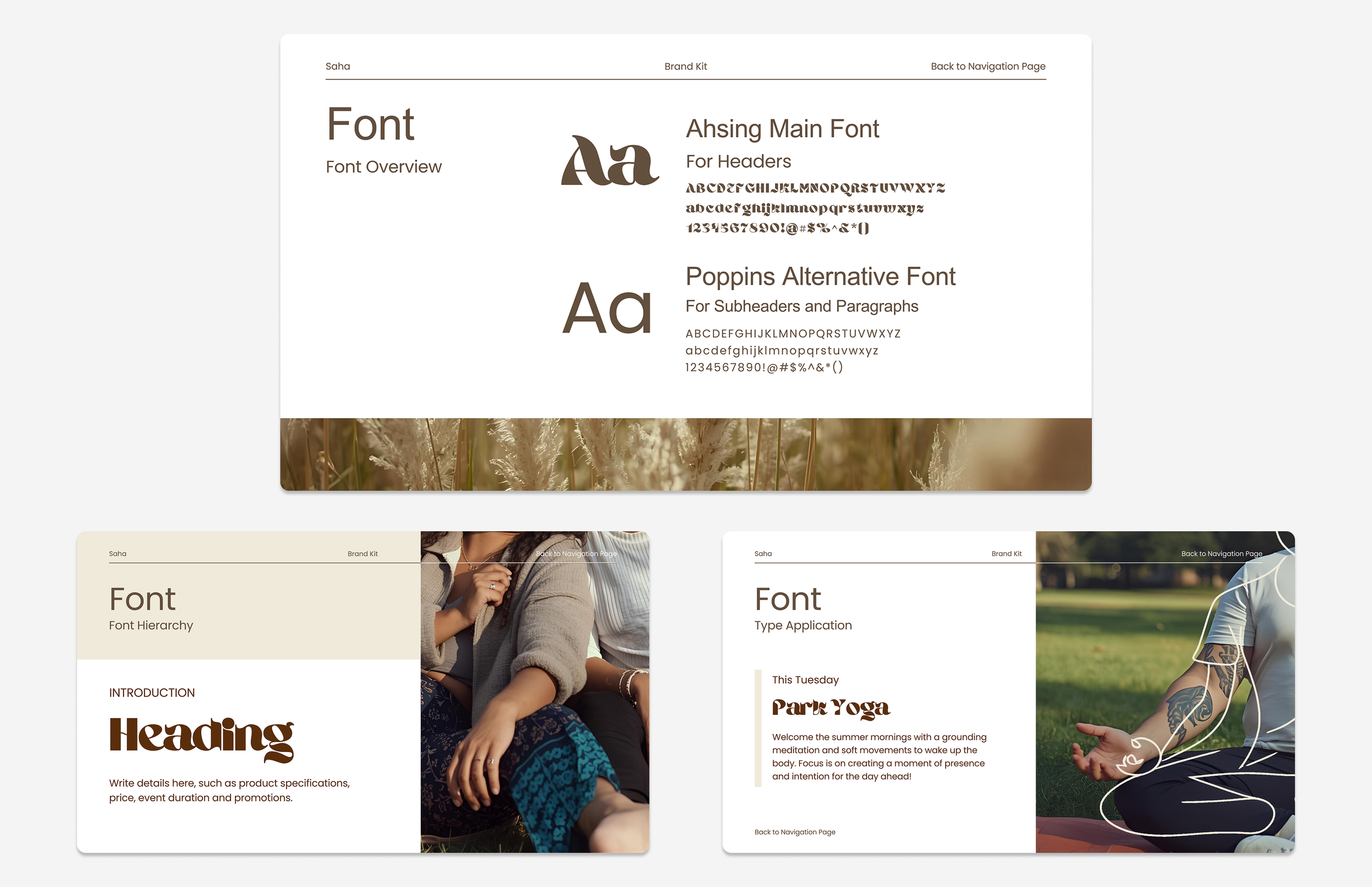
Typography
Typography was chosen to reinforce Saha’s visual balance:
Ahsing: Used for headers, brings character and boldness, echoing the brand’s expressive side.
Poppins: Serves as the supporting typeface, offering clarity and readability in both digital and print formats.
Together, they create a dynamic typographic pairing that feels both modern and human.
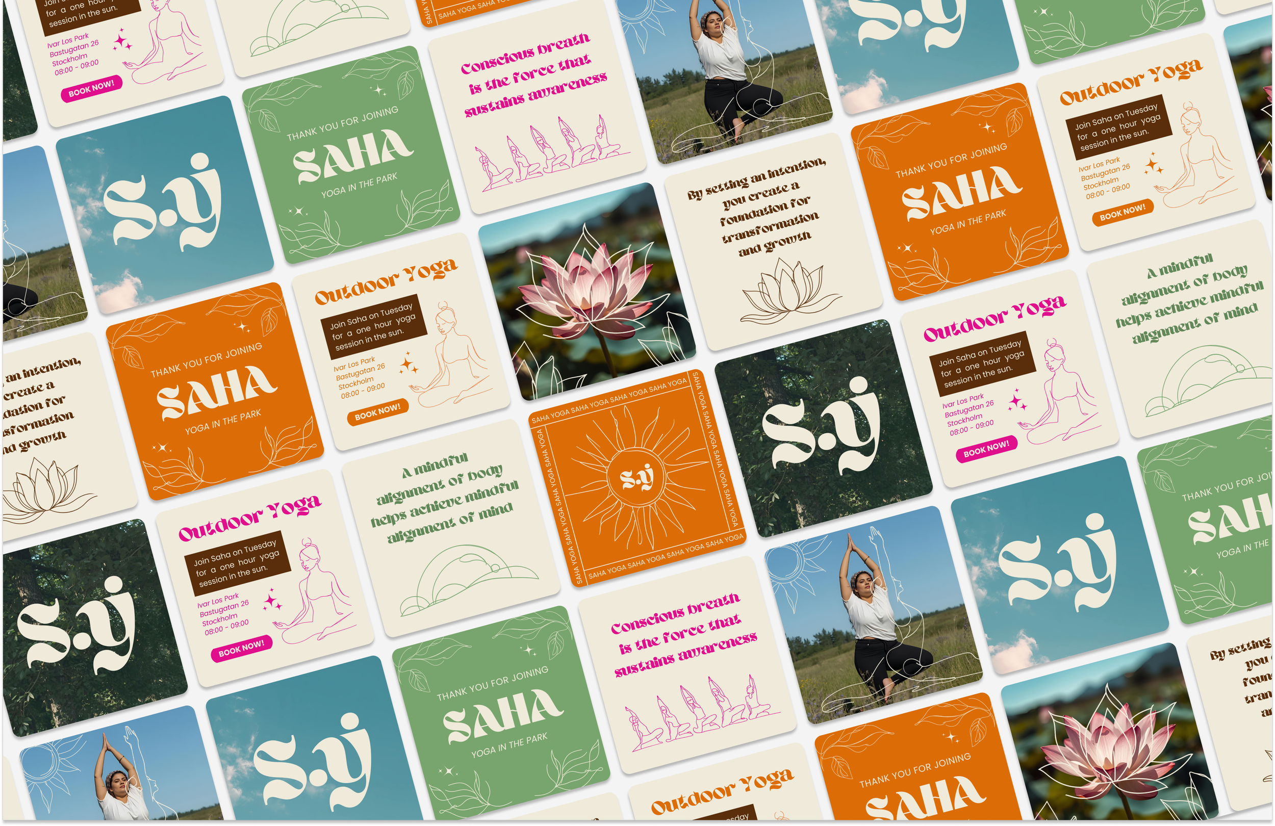
Graphic Elements & Illustrations
A collection of illustrations referencing nature and people: night, day, water, landscapes, flowers, foliage, and human figures.
Their organic softness complements the bold typography and colour palette, creating a feeling of harmony and balance.
These elements allow the brand to express different moods and narratives across communication touch-points while maintaining coherence.
Social Media & Digital Applications
Social media layouts were designed to feel both vibrant and cohesive. Guidelines emphasise pairing one bold colour with a lighter counterpart to maintain subtlety, using no more than three colours per creative asset.
Typography hierarchy and visual rhythm ensure that Saha’s content feels clear, inspiring and instantly recognisable in a fast-moving digital landscape.
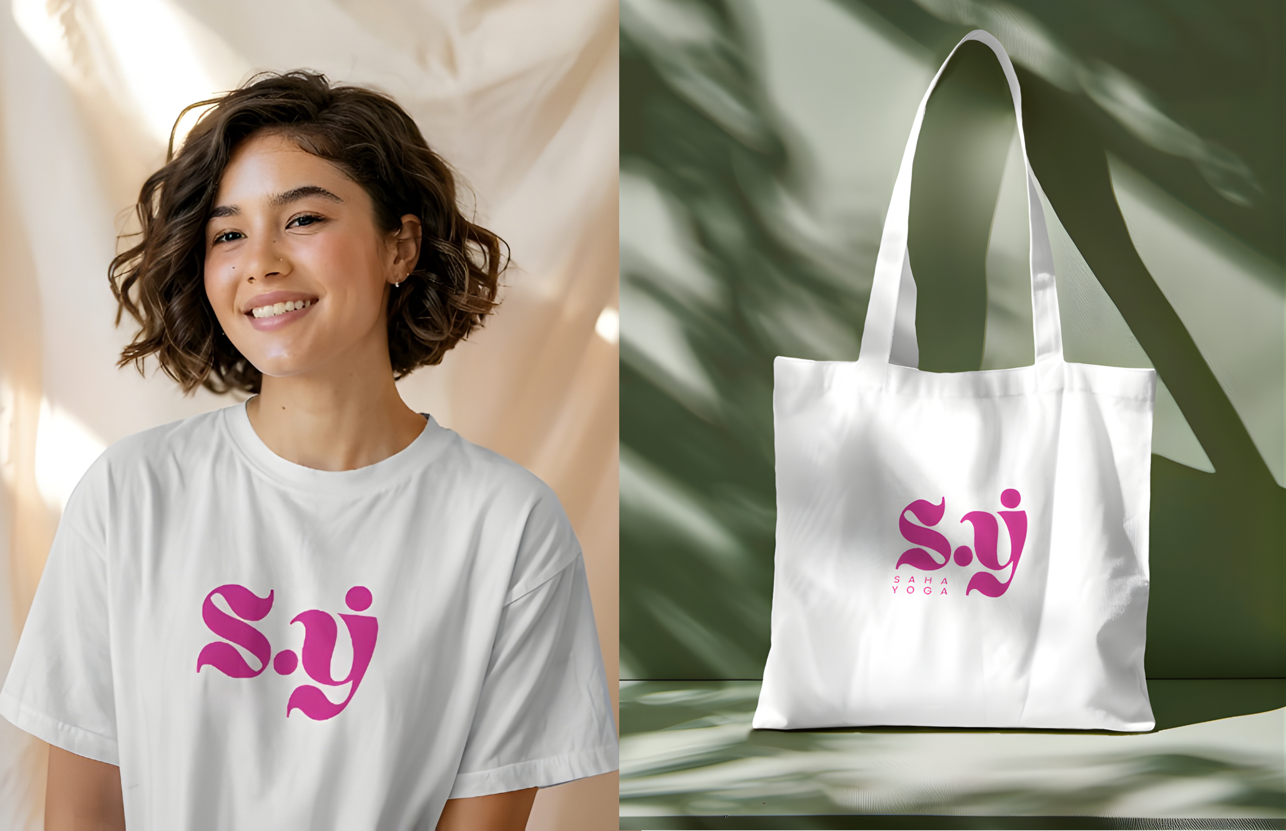
Offline Touch-points
Branded merchandise featuring the new brand logo, from t-shirts to tote bags, transforms community members into brand ambassadors.
These items extend the brand’s presence into daily life and public spaces, fostering curiosity and connection while reinforcing the sense of community so central to Saha’s core values.
Impact
100% increase in followers since launch of new branding
53% increase in post interactions
34% increase in daily Instagram profile visits
The new Saha Yoga identity feels energetic yet calm, vibrant yet inclusive, a visual reflection of the brand’s holistic mission.
It successfully sets Saha apart from local competitors by embracing creativity, colour and human warmth. The flexible brand system supports both physical and digital touch-points, ensuring consistency as the brand grows into new offerings such as creative arts and corporate wellness.
Reflection
This project challenged me to explore the space between minimalism and maximalism, finding beauty in balance. Crafting an identity that felt both energetic and gentle required continuous experimentation with form, texture and tone.
Ultimately, the result captures what makes Saha Yoga unique: a community that celebrates individuality, connection and creativity, all grounded in mindfulness and nature.