MoveWell
Role
UX designer
Date
May 2025
Project Type
Digital product

Movewell is a workout app designed for older adults and a Bergh's UX design project. With a strong focus on accessibility and inclusive design, Movewell features larger buttons and text, intuitive navigation and vertical/horizontal scroll support to cater to a range of individual needs. A solution to promoting health and wellness for older adults.
Problem
Older adults (65+) often struggle to stay physically active largely due to physical limitations, reduced mobility and
fear of injury. Yet staying active is crucial for their overall health, independence and quality of life.
Solution
We designed a digital exercise solution that empowers older adults to stay active by offering personalized, adaptive workouts that accommodate age-related limitations, making fitness more approachable, safe and enjoyable for the senior user group.
Team and Project
This project was carried out by myself and two other UX and digital product design students, with backgrounds in Sweden, the UK and South Africa, completed as part of the UX course at Berghs School of Communication.
Design Process
Design Iterations:
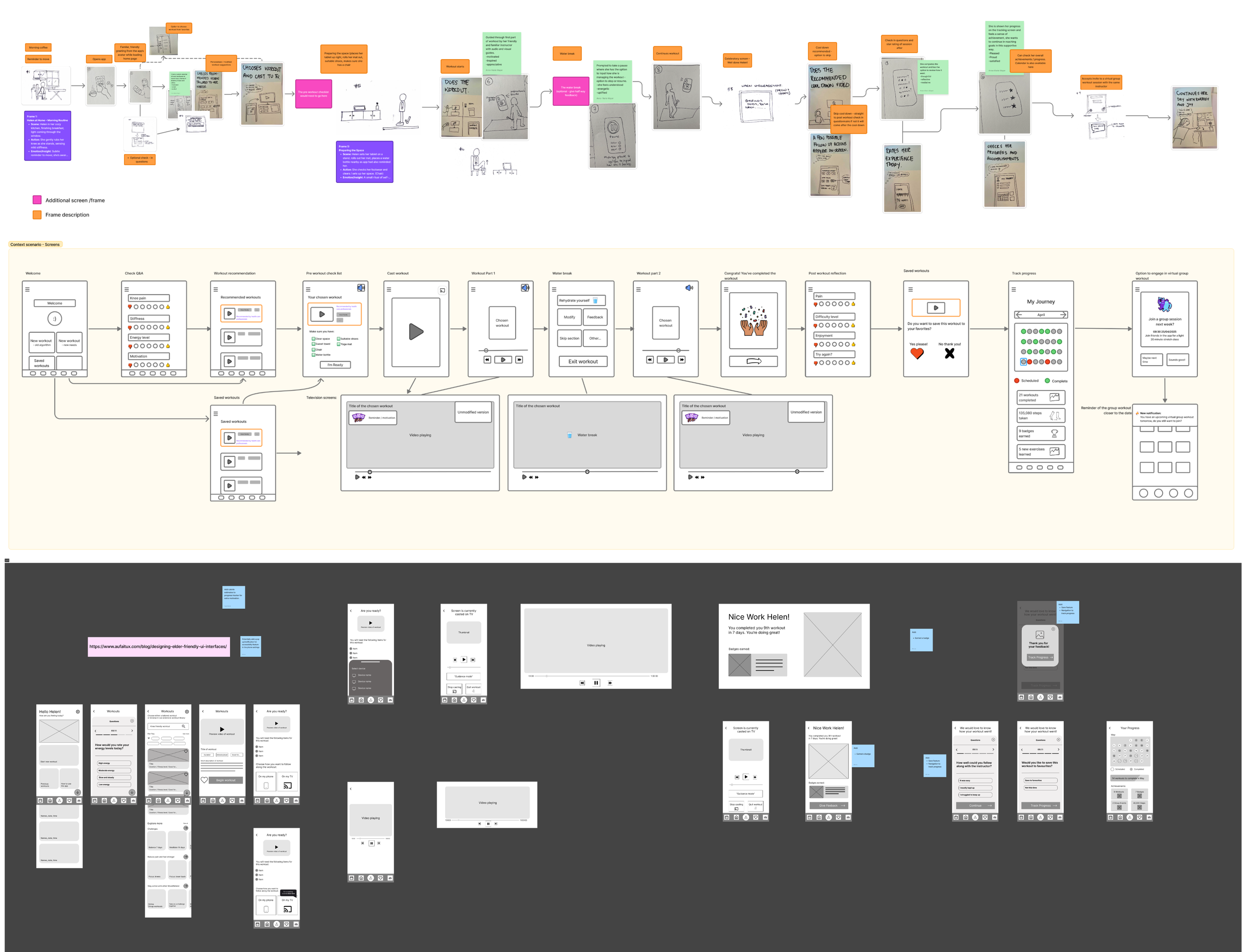
During the process we simplified the language, user journey, design and accessibility of the app. An example of this would be the navigation bar update. We used more obvious icons and added in the text version below to make it easier for users to identify where each button leads to.
Challenges:
Designing for older adults brought challenges like ensuring accessibility, accommodating diverse tech literacy, managing slower testing processes, avoiding age-related bias, aligning with their unique fitness motivations and addressing physical or cognitive limitations.
Decision Making:
Our decision-making process was fairly straightforward, as many of our participants shared similar frustrations and feedback, which made it easier to identify common problem areas. We held frequent team huddles to review insights, discuss patterns and explore the best possible outcomes together. While it was sometimes challenging to decide on the right solutions, these collaborative discussions allowed us to explore a range of ideas more thoroughly and make more informed, user-centered decisions.

User Research
Research Objectives:
Identify the barriers and challenges that prevent older adults from staying physically active.
Explore the key drivers and motivators that encourage physical activity among older adults.
Gain insight into what physical exercise means to older adults, including their preferences, routines and habits.
Examine the obstacles older adults face when using digital apps or products related to physical activity.
Methodology and Approach:
Desktop research.
9 user interviews.
3 subject matter expert interviews -
an occupational therapist, medical doctor and personal fitness trainer.
Target Audience:
Senior adults, approximately aged 65+, residing in Sweden, UK and South Africa.
An interest in staying fit, healthy or active.
Previous experience of using digital products.
Drawing on the insights from user and subject matter experts, we used affinity mapping to build our user persona.

User Journey
Our journey map illustrates Helen’s experience from initial product awareness to completing her first workout within the app. As someone who is not particularly tech-savvy, Helen encounters several frustrations and pain points throughout this journey. These challenges largely stem from her uncertainty around using digital tools and concerns about accessibility and inclusivity as a senior.
Opportunity Funds:
Ensure the app feels warm, friendly and inclusive through thoughtful design and clear, jargon-free language.
Reduce cognitive load and prevent users from feeling overwhelmed, e.g. through digestible screen and easy navigation.
Incorporate personalization and intelligent algorithms that remember user preferences and settings over time to create a more seamless and tailored experience.

Ideation and Brainstorming
How might we…
Make technology feel more trustworthy and user friendly for older adults to encourage adoption?
How might we…
Reduce fear and uncertainty around movement for those with medical or physical limitations?
How might we…
Design fitness experiences that align with a maintenance mindset while still fostering a sense of progress and accomplishment?
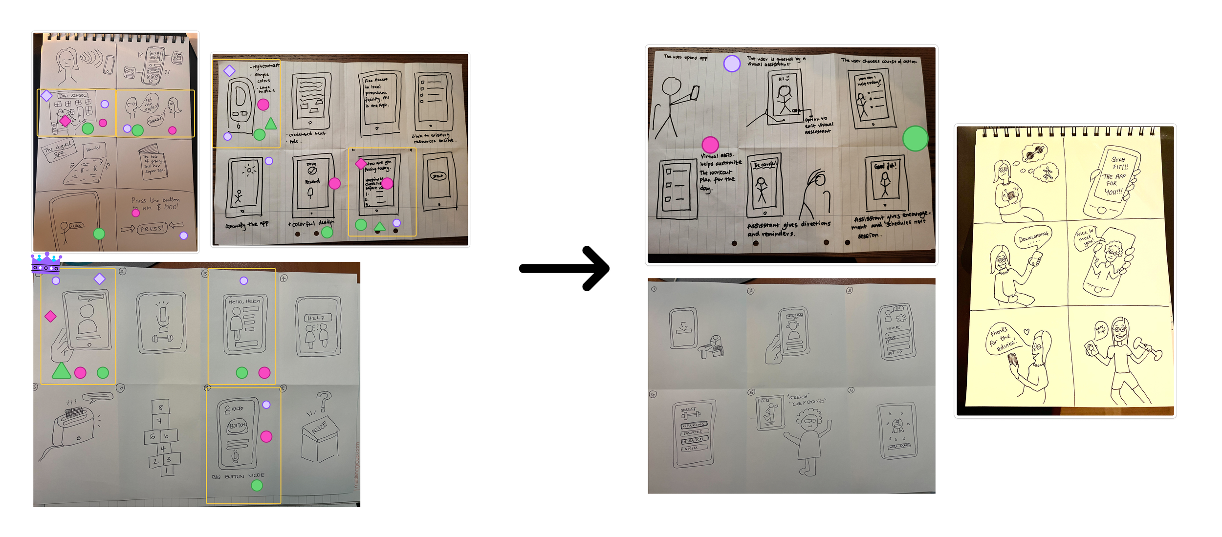
Based on affinity mapping and user journey mapping, we developed 3 key ‘how might we’ questions to ideate on.
Using the ‘crazy 8’s’ method in rapid ideation sessions and the ‘dot voting’ system, we selected the strongest concepts to produce storyboards from and further develop.
Desirability Testing
Objective of the test:
To evaluate how users emotionally respond to and perceive the desirability of a product’s offerings and visual design at a glance, using the ‘cereal box’ method to present our value proposition.
Key messages to present:
Stay healthy and workout safely.
Prevent physical and mental health decline in an evidenced-based, accessible way.
A health app designed for older adults, considering their needs and limitations.
A reliable, trustworthy service they can depend on.
Easy to use for older adults.
Following testing sessions with our users, we made iterations to the initial value proposition based on feedback and insights.
User Testing Insights:
Frame value proposition clearly from the user's perspective.
Testimonials build trust by showing product value, especially for older adults.
Endorsements from healthcare professionals further boost confidence and a sense of safety.
Make it clear that the product is not cereal, even though it is presented as a cereal box.
Clear messaging, no need to be too repetitive; find key words and highlight them clearly, otherwise too much text is overwhelming.
Users are able to relate to other peer users and responded positively to the avatar characters.
Sometimes less is more, 6 avatars to showcase personalized instructors felt unnecessary; 3 avatars would be enough.
Users particularly liked the lilac colour in the visuals.


Design Iterations
From insights drawn from further user testing sessions we continued to iterate on our designs from sketches to wireframes.
The Solution
In a Nutshell
Workout app designed for older adults.
Strong emphasis on readability, accessibility and inclusive design.
Featuring larger buttons and text, intuitive navigation and vertical/horizontal scroll support, accommodating a range of physical and visual needs.
Users in Mind
Personalized workout system powered by built-in algorithm that adapts exercises based on each user's goals and physical needs.
Every workout video is paired with a 'Form and Safety Tips' tutorial to ensure users perform movement safely and confidently.
Wellbeing
A community space is featured to promote connection between others sharing similar interests and goals.
This fosters a sense of belonging and promotes mental well-being alongside physical health.
Impact
User feedback from test iterations:
Users experienced a high level of accessibility in terms of readability, use of icons, colours and layout.
Users responded positively to language updates regarding jargon and terminology such as ‘algorithm’ that not they were familiar with in the testing phases.
Overall sense of ease in using the product. During testing we identified unnecessary steps in the flow based on feedback, such as an additional screen for a water break during the workout, that users did not understand the purpose of and acted as potential barrier to engagement.
Anticipated regular usage. It came to light that the gamification and badge reward system in place was not of high importance to the user but the progress tracker was of high value in terms of promoting regular use, which we subsequently gave a higher priority to designing.

Reflections and Takeaways
Figma:
Manage component design early, it saves a lot of time when changing and improving the design in second and third iterations.
User Testing:
For a number of reasons, including digital literacy, testing sessions with this age group were often difficult to keep within the assigned time-frame. Planning and more providing information in advance, in terms of context of session and instructions could be beneficial here.
65+ age range:
The older adult age group and having limited resource to user testing platforms, proved a big barrier to recruiting participants for testing, especially those who weren’t known to us personally already.
Field Work:
In-person field research could have brought added value that we did not have the capacity to facilitate during this project - the opportunity to understand on a deeper level, the needs or users and digital capabilities of users.
Team Work:
The three members of our team had mostly, clashing schedules which made work and collaborative sessions hard to schedule. However, we did try to plan at the beginning of each week based on personal schedules, to ensure collaborative work time, even though that meant late sessions on Sundays.
Next Steps
Conduct usability testing with a broader group of older adults.
Iterate and improve design further.
Build on other app features like the onboarding process or community page.
Collaborate/consult health care professionals.
There is definitely room for and need for digital services within this area of health for the older adults age group, providing the user's needs are properly considered. Older adults may lack a certain level of digital literacy however, are largely open to learning and developing skills here.